


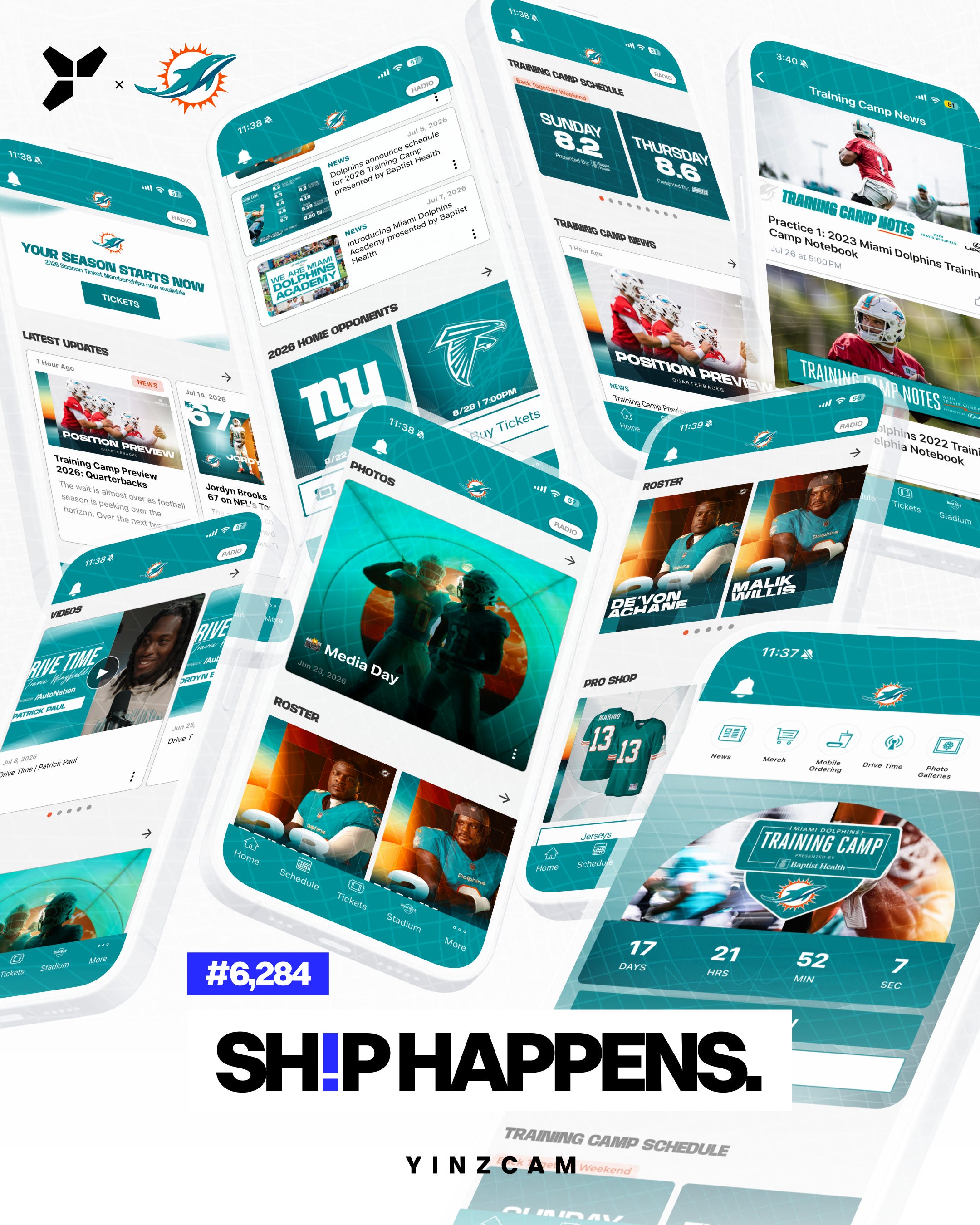
𝐓𝐡𝐞 𝐮𝐥𝐭𝐢𝐦𝐚𝐭𝐞 𝐭𝐞𝐚𝐥 𝐓𝐫𝐚𝐢𝐧𝐢𝐧𝐠 𝐂𝐚𝐦𝐩 𝐭𝐚𝐤𝐞𝐨𝐯𝐞𝐫.
The Miami Dolphins' Training Camp is here, and fans are invited to watch the team at work. The Dolphins app is ready, with everything you need to plan your visit to Camp, all in one place:
🐬 RSVP to attend open practices, and see what's on at Camp.
🐬 The complete Training Camp schedule as a carousel, each day with its sponsor and theme.
🐬 Camp news, articles, videos, and photo galleries.
🐬 The 2026 Dolphins home schedule, with direct links to buy tickets.
🐬 The current roster, linking through to the full squad.
🐬 Camp gear: jerseys, shirts, hats, and a path to all the merch.
🐬 A Dolphins chatbot assistant, ready to answer fans' questions.
Here's the best part, and the part that matters for the user experience: nothing got taken away to make room for Camp. The Top 5 personalized shortcuts, the social-media links, the Season Ticket Membership promo, are all still right there, as the user expects on the homepage. The Camp takeover simply layers on top of the app and the digital experience that fans already know and love.
Everything added. Nothing lost.
Novel and yet familiar at the same time.
Fins up.
👏 𝖪𝖴𝖣𝖮𝖲. Thank you, Miami Dolphins and Hard Rock Stadium team, for all the digital takeovers you've allowed us to collaborate with you on, including the one for the NFL Draft and now Training Camp. We love how your brand absolutely shines in these different layouts. I particularly love the emphasis on maintaining familiar layouts for the fan, while refreshing the design elements and the information just in time for Training Camp.
🎬 𝖢𝖱𝖤𝖣𝖨𝖳𝖲. Monica Crowsey and Alexis Giobbi for the build. Ana Baskinger for the 𝘚𝘩𝘪𝘱 𝘏𝘢𝘱𝘱𝘦𝘯𝘴 graphic.