


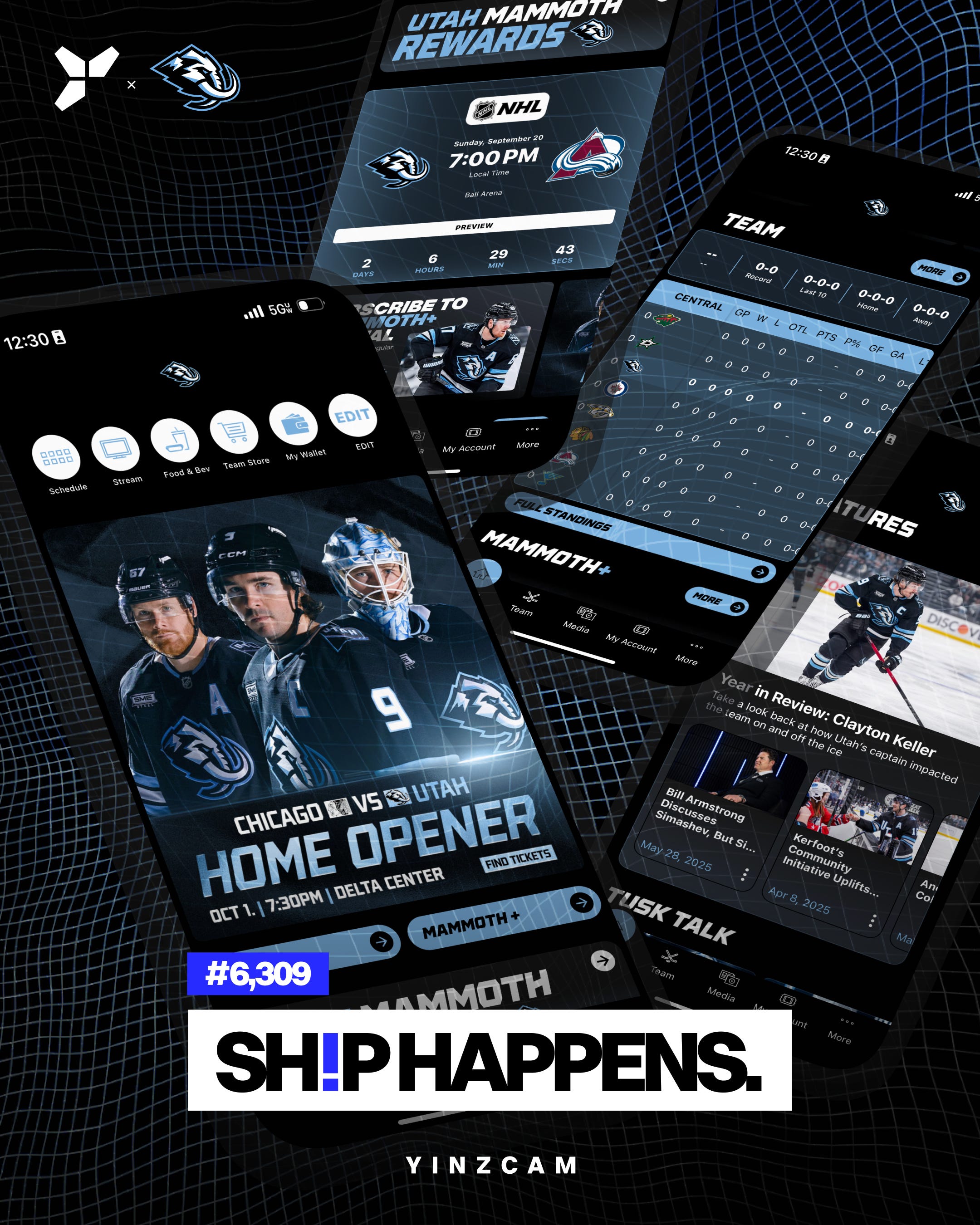
𝐀 𝐧𝐞𝐰 𝐥𝐨𝐨𝐤 𝐟𝐨𝐫 𝐚 𝐧𝐞𝐰 𝐬𝐞𝐚𝐬𝐨𝐧. 𝐌𝐚𝐦𝐦𝐨𝐭𝐡, 𝐫𝐞𝐟𝐫𝐞𝐬𝐡𝐞𝐝.
The Utah Mammoth head into their third season with a refreshed app, with a redesigned home page, and a Gameday Hub built to switch on when it matters most.
🦣 A marquee graphic up top, promoting the home opener: opponent, date, and time, front and center. Chicago at Utah, on October 1 at the Delta Center, a rematch of the franchise's very first game.
🦣 A custom scorecard with a countdown to puck drop right below it, building the excitement and pointing fans straight to their tickets.
🦣 A push to subscribe to Mammoth+, the home of every Utah Mammoth content series.
🦣 Quick access to standings, evergreen and ever-updating all season, keeping fans on top of those all-important conference and division standings.
🦣 And the essentials, one tap away: Schedule, Stream, Food & Bev, Team Store, My Wallet.
Then there's the new Gameday Hub. This, to me, is the really special piece: the Gameday Hub 𝘢𝘶𝘵𝘰𝘮𝘢𝘵𝘪𝘤𝘢𝘭𝘭𝘺 flips live only for the Mammoth's home games. The app shifts into gameday-hub mode right on cue for home games, and steps aside the rest of the time.
What fans need, when they need it, no searching, no clutter.
New season, new home screen.
New Gameday Hub.
Tusk up.
👏 𝖪𝖴𝖣𝖮𝖲. Claudia Hanrahan, Justin Kraft, I love, love, love, love how your branding positively jumps off the screen and just glows so intensely. On top of that, you have these stunning graphics and mobile layouts that are just well-thought through. I love the auto-flipping Gameday Hub concept, and I know that this will quickly become a best practice. This is a clever way to keep discoverability and usability front and center in UI/UX, and particularly for gamedays. Thank you for collaborating with us, and for transforming the Utah Mammoth app into such a glorious app experience.
🎬 𝖢𝖱𝖤𝖣𝖨𝖳𝖲. Lexie Vigna, Alexis Giobbi, and George Oakley for the build. Ana Baskinger for the 𝘚𝘩𝘪𝘱 𝘏𝘢𝘱𝘱𝘦𝘯𝘴 graphic.